In 2023, the flexible packaging industry saw positive developments despite challenges for some firms. Sonoco achieved record profits, TC Transcontinental maintained stable revenues and increased earnings, and Winpak benefited from lower raw material prices, improving profit margins. The industry's consolidation trend was also evident in the Top 25 converters list for the year.
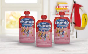
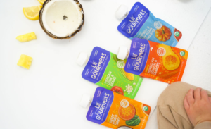
Every Lil’ Gourmets’ meal delivers a complete serving of vegetables, meeting 100% of a baby’s daily vegetable needs and 50% of a toddler’s, without any added sugar.
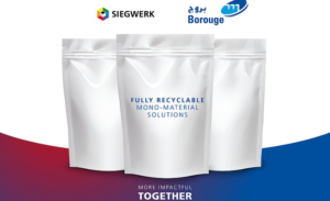
These new compounds, PHACT™ CA1270P (clear) and PHACT™ CA1240PF (opaque), mark a significant advancement in sustainable flexible packaging, offering excellent performance and environmental benefits.
The installation of new, state-of-the art equipment – primarily in northeast Wisconsin over the next 18 months – will expand and optimize capacity while further increasing network reliability and responsiveness to serve customers in an essential market.
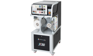
The X350 is designed to bridge the market gap between desktop label printers and high-end piezo head-driven digital inkjet presses, offering a cost-effective solution without the six-figure price tag.
Following Coveris’ recent acquisitions of packaging sites in Hungary, Poland and Czech Republic, HADEPOL FLEXO marks the packaging leader’s fourth acquisition in CEE